SNAP
Design, Art Direction, Photography, Lighting, Prop Styling, Copy, Retouching
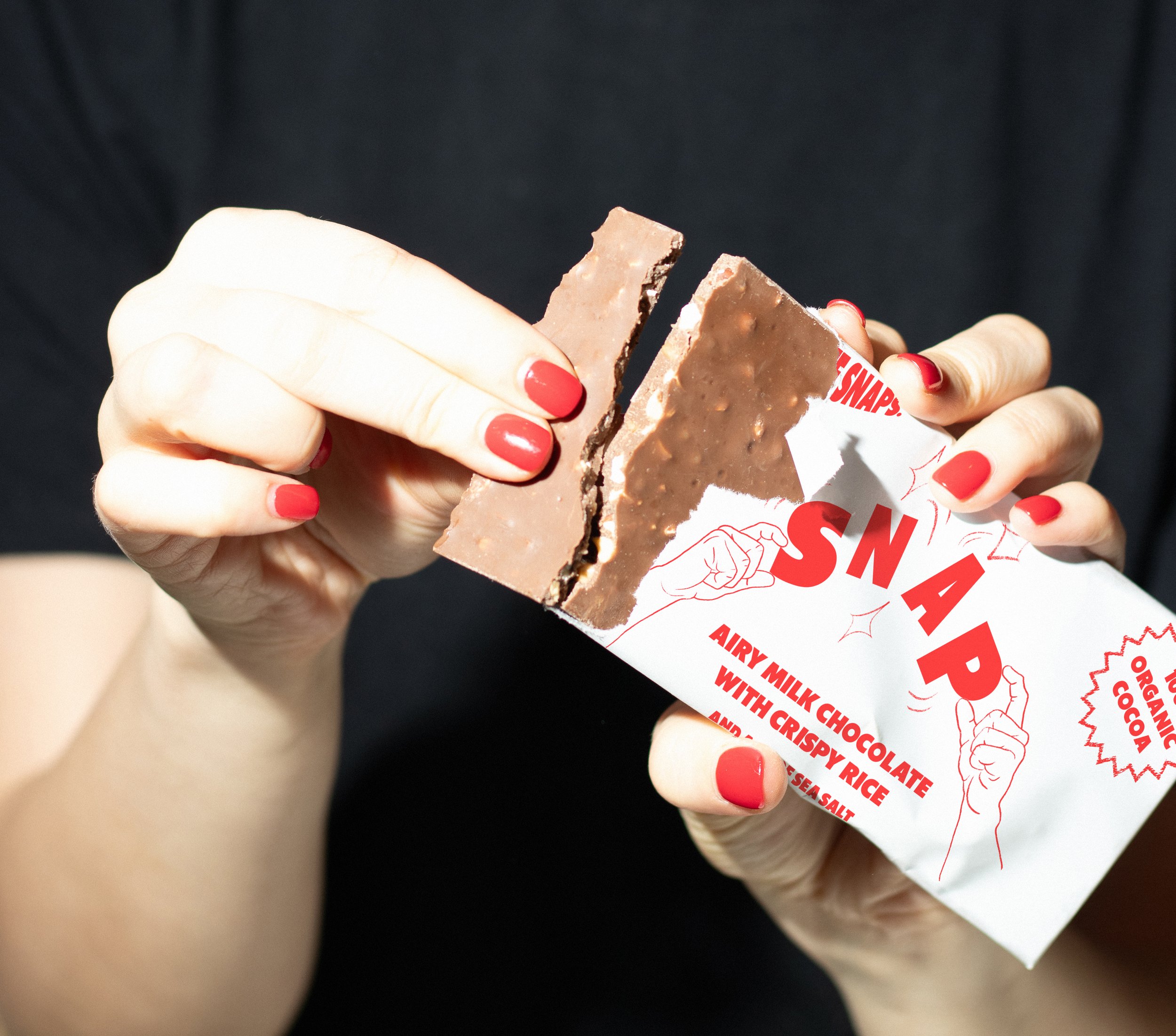
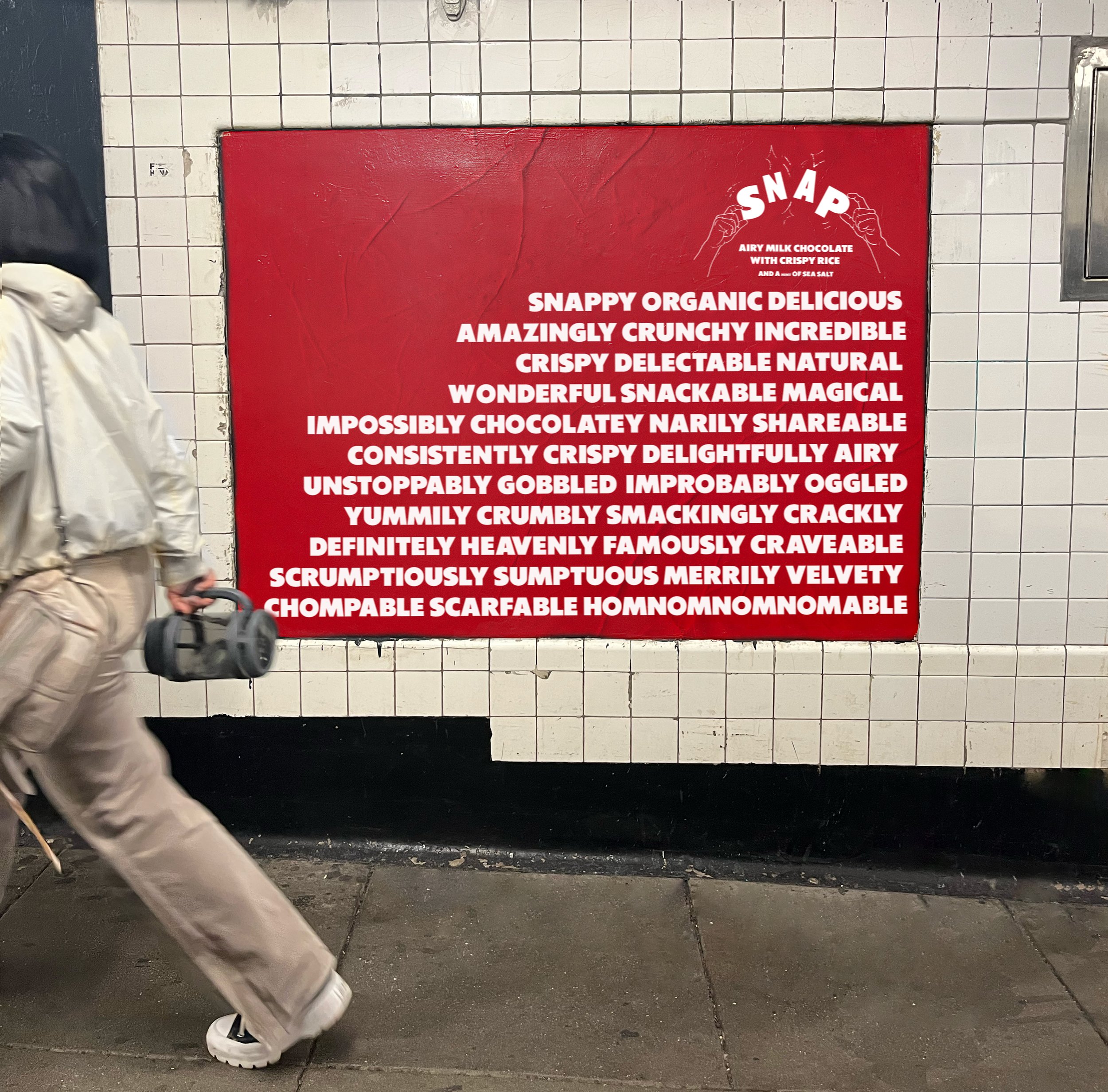
SNAP is a chocolate brand with a vibrant, whimsical identity, going against the chocolate-that-looks-like-soap design grain of recent years.
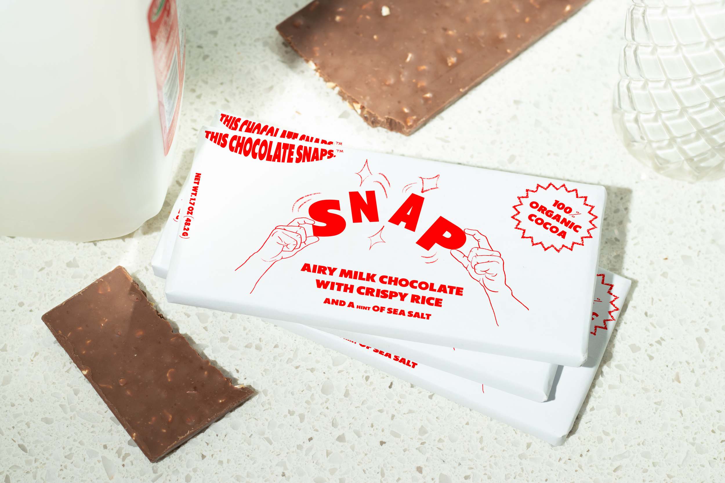
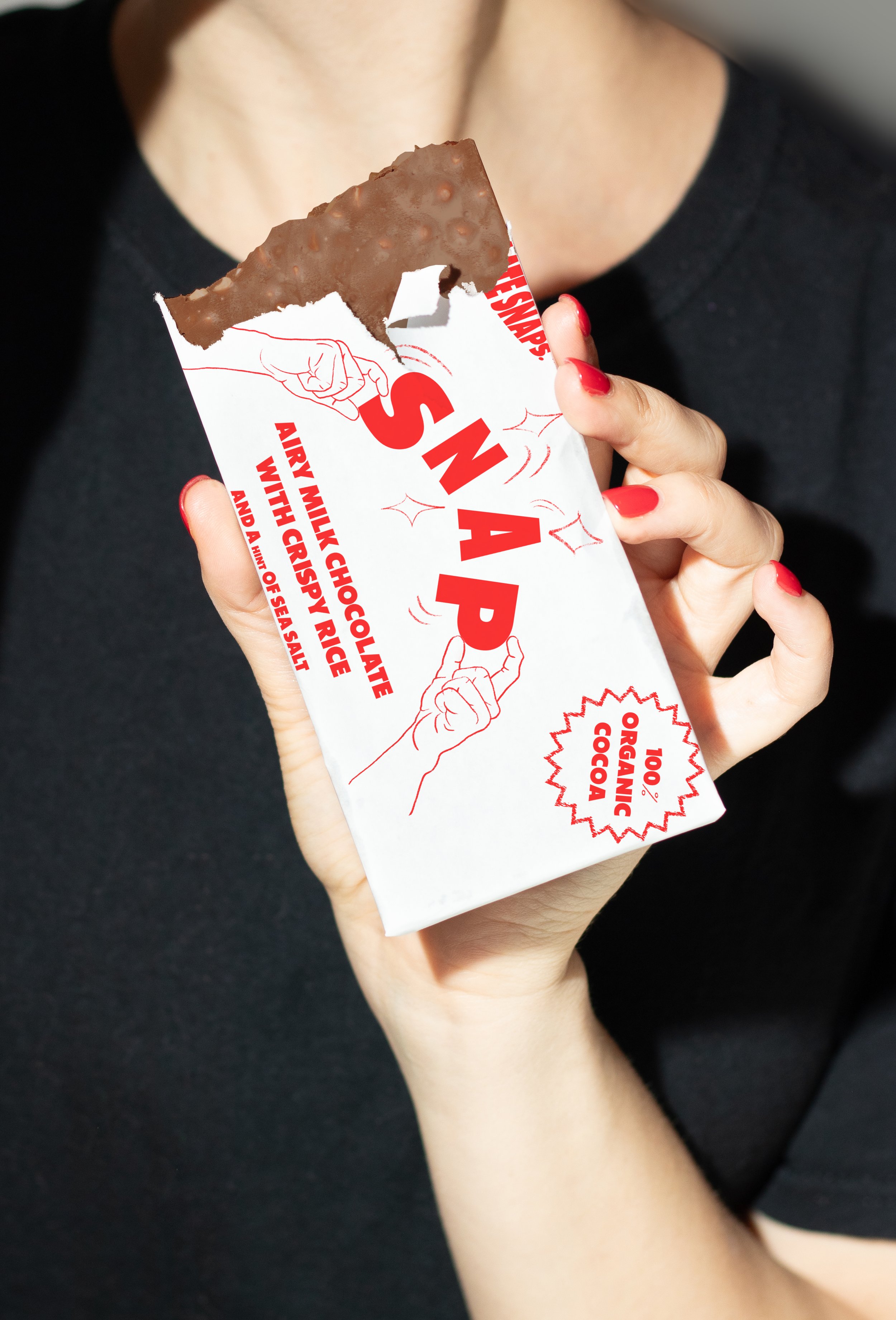
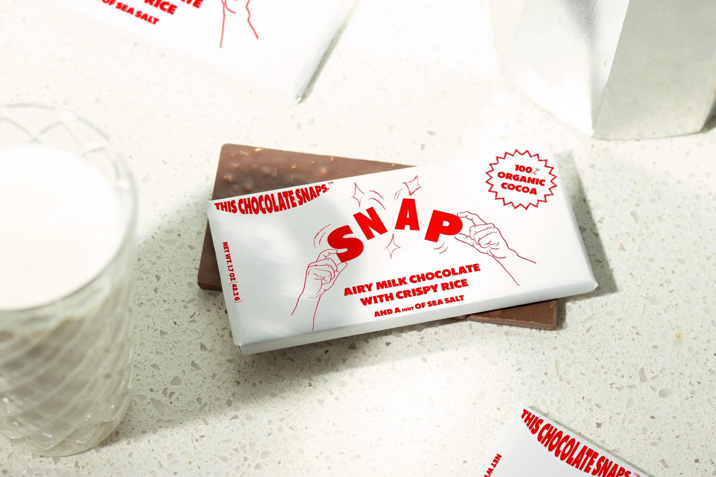
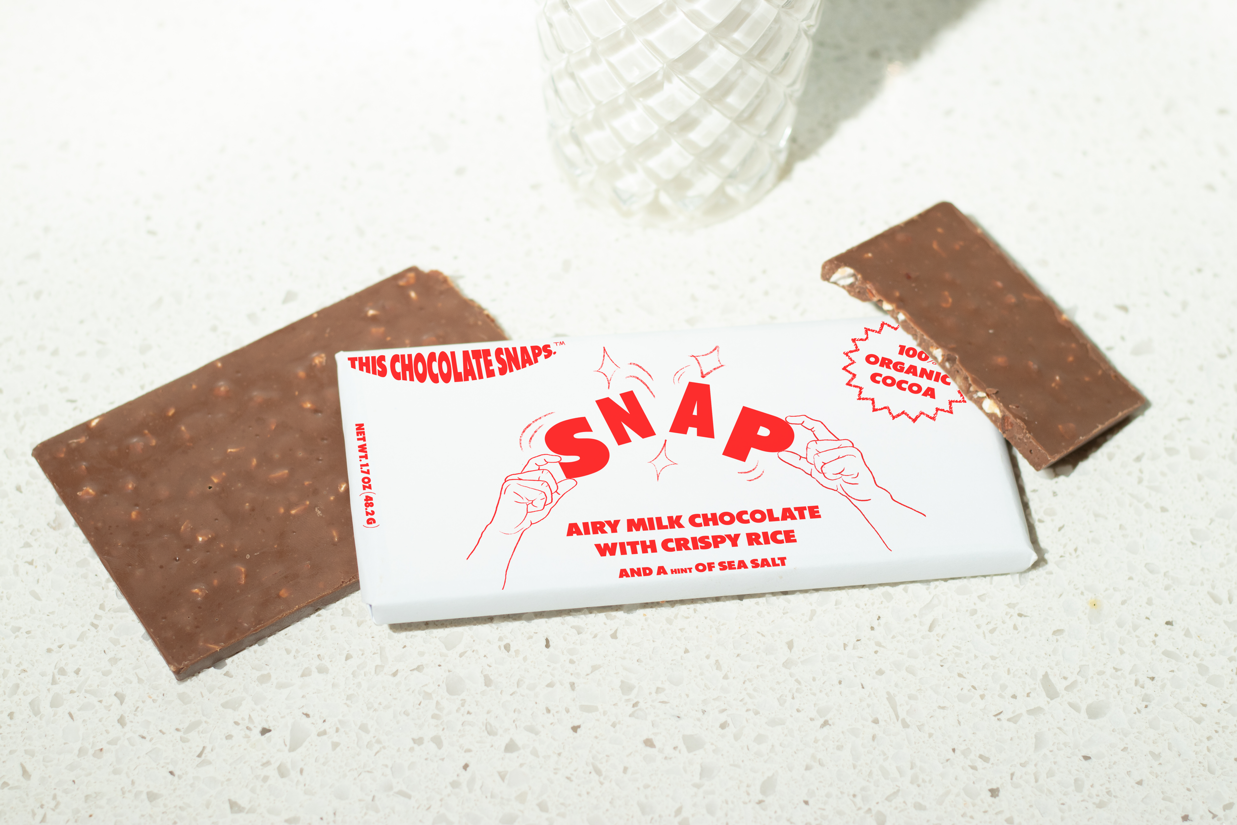
Two illustrated hands literally “SNAP” the namesake in half—a visual pun imparting the brandname and chocolate texture all at once. The sharp red/white color way is reminiscent of
whole milk containers, creating a distinct pop that draws attention from a distance.
The original photography combines bright, mid-century-esque art direction with the hard flash of today’s generation—reinforcing the retro charm while appealing to modern snackers.

